Overview
Eat Good is a mobile app designed to make healthy food more accessible in food deserts on Chicago’s West and South side. The app is complimented by a responsive website. Users contribute to a food budget that is gifted to a household struggling with food insecurity.
Timeline
May 2022
to August 2022
Role
Sole UX designer
Sole UI designer
Sole UX researcher
Tools
Figma
Adobe Photoshop
Pen & Paper
Eat Good Mobile app and Website
Communities on Chicago’s West and South side are struggling with food insecurity. There are few to no restaurants that serve healthy food options. Many of these households are in food deserts, which means residents have to travel long distances to reach grocery stores. Additionally nutritious foods and fresh produce often come at a higher price point than can be regularly afforded by the average South or West Side Chicago household income.
Eat Good is a website that would allow users to create food benefits. Households in food deserts will use the Eat Good mobile app to access the food benefits and order healthy food straight to their door.
The Goal
The Eat Good website would allow for the creation of food benefits. Users would use these benefits to order healthy meat and produce through the Eat Good mobile app to be delivered to their front door.
The Problem
There is a dearth of healthy food options in neighborhoods on Chicago’s West and South side. This and other factors contribute to these communities struggling with food insecurity.

MOBILE APP

RESPONSIVE WEBSITE
User Research Summary
I researched studies on urban foodscape trends, conducted usability studies using a low fidelity prototype. Data from the usability study was arranged into an affinity diagram. Themes were drawn from the diagram and insights gleaned from those themes informed the project’s final design.
Going into this project I knew little of food insecurity. Research towards this project broadened my understanding of food deserts and the need for solutions like Eat Good.
Competitive Audit
Who was accomplishing a similar task? My research determined “Meals on Wheels”, “Tangelo” and “Urban Growers Collective” provided similar products. I assumed I would find more direct competitors, however there aren't many entities addressing this specific problem in Chicago.
Tangelo
direct competitor
Gaps: App only available in English, Cannot order food via website
Chicago Greater Food Depository
indirect competitor
Gaps: No mobile app
No direct delivery
Urban Growers Collective
direct competitor
Gaps: No mobile app
Meals on Wheels
direct competitor
Gaps: No mobile app
Website only available in English
User Personas


Ideation
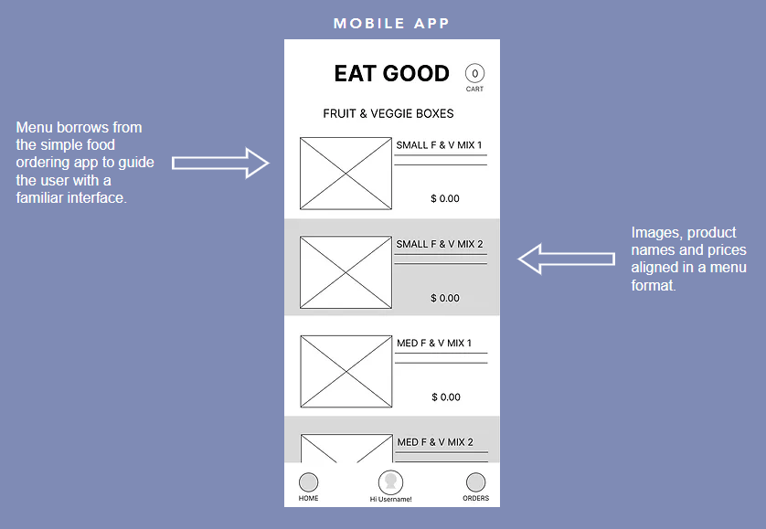
My aim was a simple interface that borrowed from the familiar traits of food ordering apps to avoid adding stress to the user experience. And to limit the amount of steps needed to complete the user journey.

Starting the design
Digital wireframes
Apps like doordash and grubhub were mentioned by a few users during interviews. This told me a design similar to food ordering apps would be familiar to users.
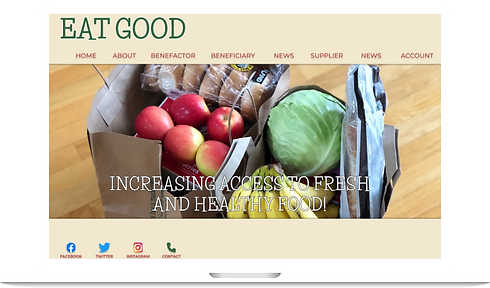
The website was designed to raise public awareness of food insecurity and allow for the creation of food benefits that would be accessed through the app.

Low-fidelity prototype
This prototype demonstrates the the mobile app being used to shop for healthy food to be delivered to the user’s home. Peer feedback highlighted the importance of the user being able to track remaining food benefits after ordering.
Refining the design
Mockups
After the study I realized that I needed to provide a cart to track shopping.

The information architecture of the product page was refined to better guide the user.

High-fidelity prototype
The mobile app prototype demonstrates the mobile app being used to shop for healthy food to be delivered to the user’s home. Information architecture was refined using key insights gleaned from the usability study to guide the user.
While the website prototype allows a user to create benefits for someone other than themselves. The website produces a token the beneficiary would use to start ordering healthy food via the Eat Good app.
Open Hi-fi Prototype


Accessibility considerations
The goal of my study was to collect KPIs that would inform the project’s future mockup and hi fidelity prototype. My two findings are listed below.
1
Color contrast
The Eat Good color palette was chosen to keep the app accessible to users who are color blind.
2
Screen readers
Headers will facilitate those who use built in screen readers to use the app.
Responsive design
The website design would allow users to create and manage food benefits for themselves or others. It would allow suppliers to partner with Eat Good to provide food and resources.
And it would educate visitors about food insecurity and Eat Good’s mission.
Sitemap

My responsive website designs began with a mobile first approach. I believe the majority of Eat Good’s users will visit the website from a mobile device.


Takeaways
1
Impact
I see this helping someone who can’t afford to but wants to eat healthier.
Additionally, someone who has limited mobility but needs to manage a health issue through their diet could do so with Eat Good.
2
What I learned
I learned that food deserts and food insecurity in general are tough issues. But apps like Eat Good could have a great impact.

